Home
Introduction
Our Identity
Brand Basics
Logo
Colour
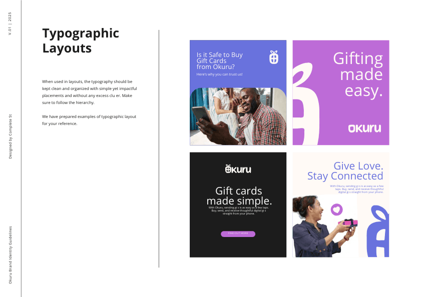
Typography
Messaging
Official Website
For more information on Typography Basics, please refer to our Complete Branding Guidelines HERE
‹ Colour
Taglines ›